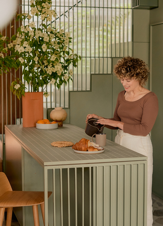
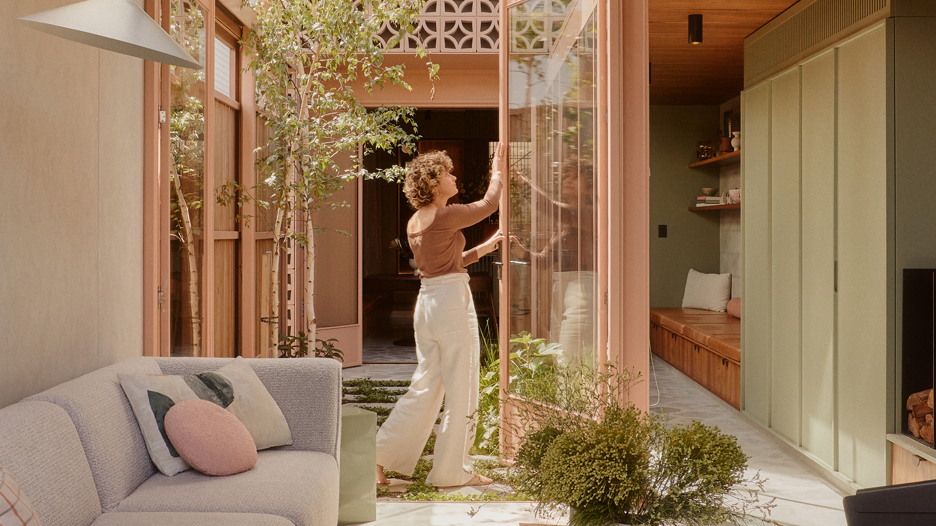
Eve Wilson is a Melbourne-based photographer who captures interiors, food, portraits, and places with an organic and intuitive curiosity, bringing a clean, crisp warmth to every shot. She lives in Cremorne, Melbourne, with her family, in a home which presents as a tiny traditional workers cottage but is backed by a light-filled, modernist-inspired extension.
Inside, a palette of warm greens, and browns delineates its spaces, marking a passage from the old to the new.
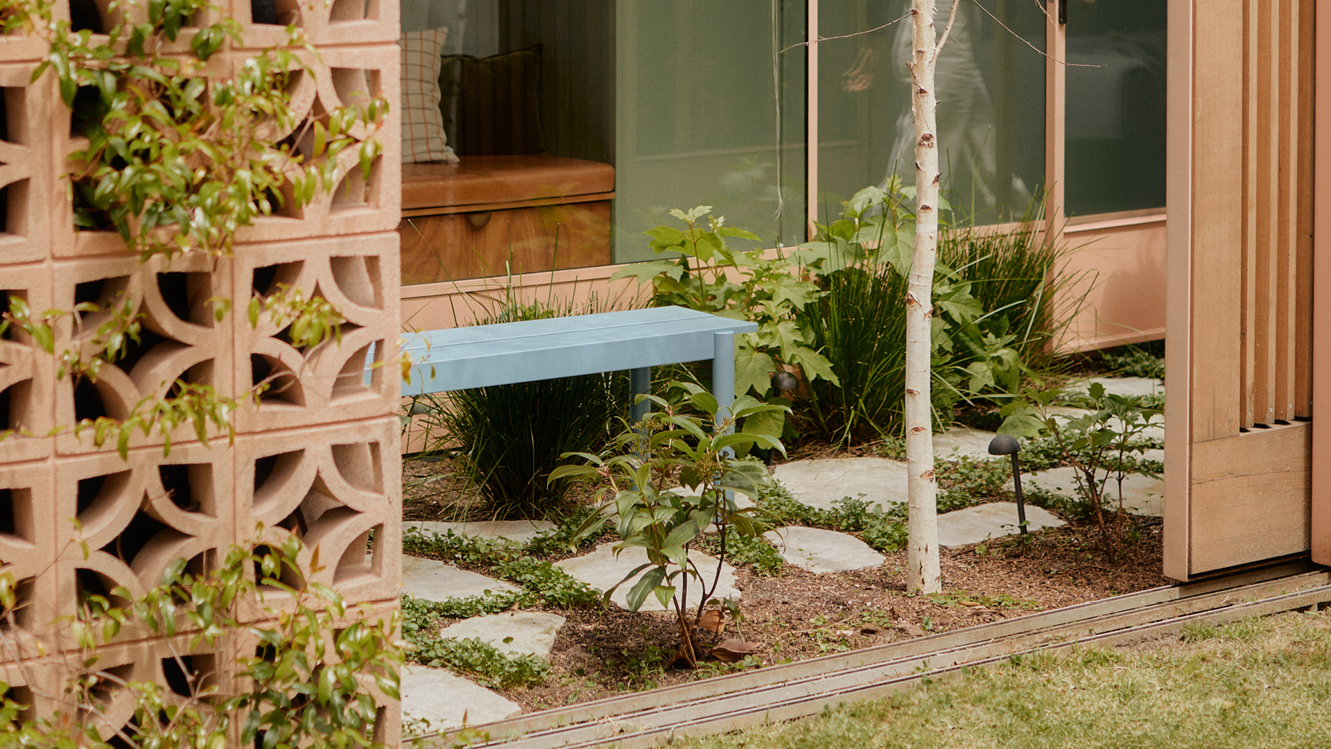
Pictured: Linear steel bench
Points of view are essential to this house, which looks very different depending on how you come at it. From the street, it appears to be little more than a tiny, traditional workers cottage, just over four meters wide. But peek down the laneway and you’ll see a mass of pink breeze blocks, vines entwined through them, flowers spilling out over glass, wood, and concrete. “It's quite spectacular,” Eve concedes.
At the centre, a glass-walled corridor connects the two, while a small green internal courtyard injects a sense of calm that permeates the whole building. It’s an easeful, elegant, and grounded home to the photographer, her husband Jon, and their two young daughters, Elliot, and June. Pleasingly for Eve, it offers up a new view almost every day.
Can you walk me through it?
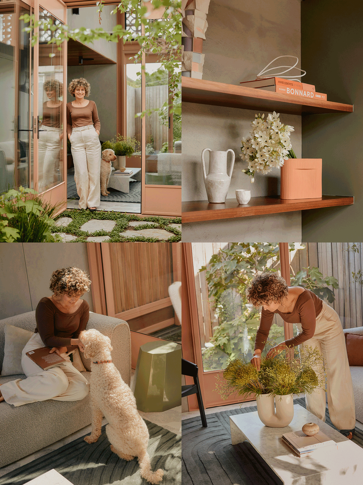
When you enter the house, you start in the oldest space. That's still quite traditionally built, so it's still got the cornices, the lighting roses, and it's all in a palette of warm off-whites. But as you move through it, you come to greens – these tastes of the new section. There are two bedrooms, a bathroom, and my study, which are all in the old building. Essentially the two buildings are joined together by a walkway. There’s a large window to one side, and the tiniest little green courtyard which takes you down into the new space, all concrete, wood, greens, and the pink exterior. That's where you get all the texture and a completely different warmth.
Where do you spend the most time as a family at home?
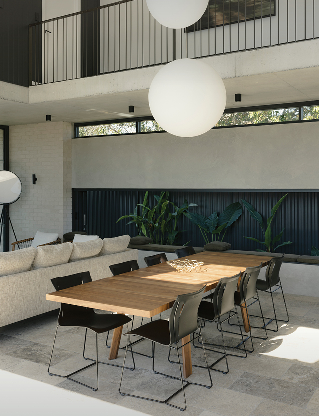
I made sure we had as big a kitchen table as we could. I wanted to be able to do a few things there at once – I’ll read the paper with a coffee while the kids are drawing. There’s music going, and if they're lucky someone's made pancakes. We spend a bit of time around that table. But actually, one of the things I love the most is when we're all using different spaces. The kids might be watching a movie or playing in the lounge room, while Jonny and I are sitting at the table, but because of the courtyard, we can see through to where they are, and vice versa. There's this really nice connection; everyone's doing something different, but you still feel like you're all together.
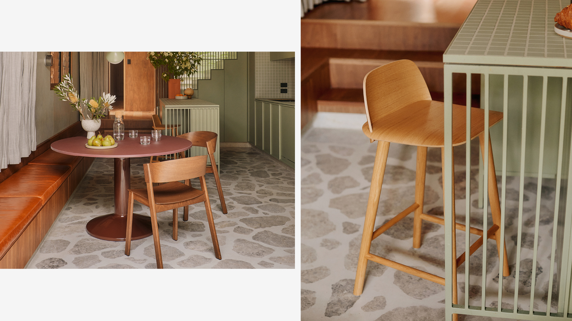
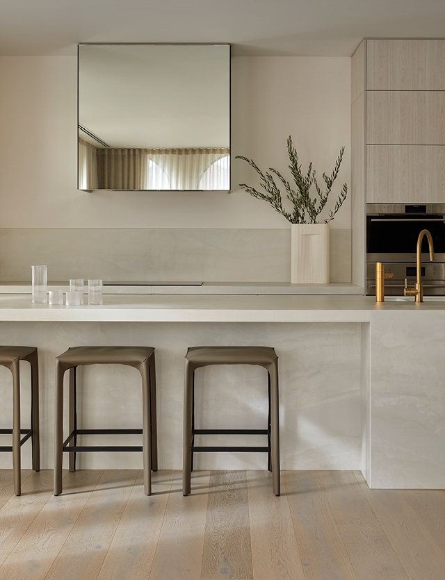
Pictured: Midst dining table, Cover side chair, Corky carafe, Corky low glasses and Nerd counter stool
Midst Dining Table by Muuto
The Midst Table and its round shape naturally draws one in, encouraging a meeting of minds and eyes. The round table takes up little space yet feels spacious — there is always room for one more guest. The refined combination of a smooth, glossy dark red base and the matte sensation of a linoleum tabletop gives the Midst Table an exclusive expression of quality.
“The house was so tiny that it needed personality, creativity – not just open-plan, with a white box on the back,” explained Eve. “I wanted textures, colour, and lots of greenery.”
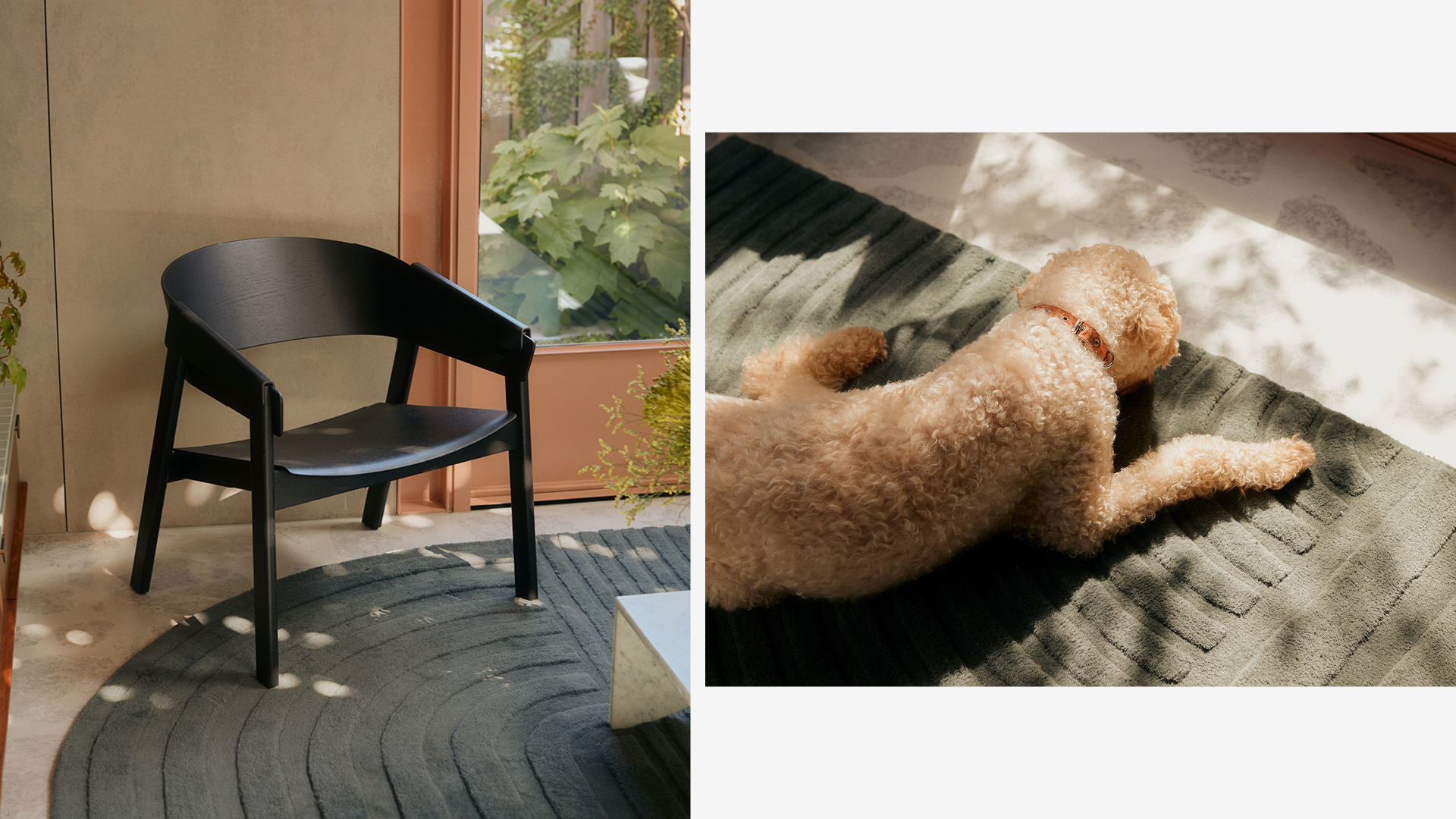
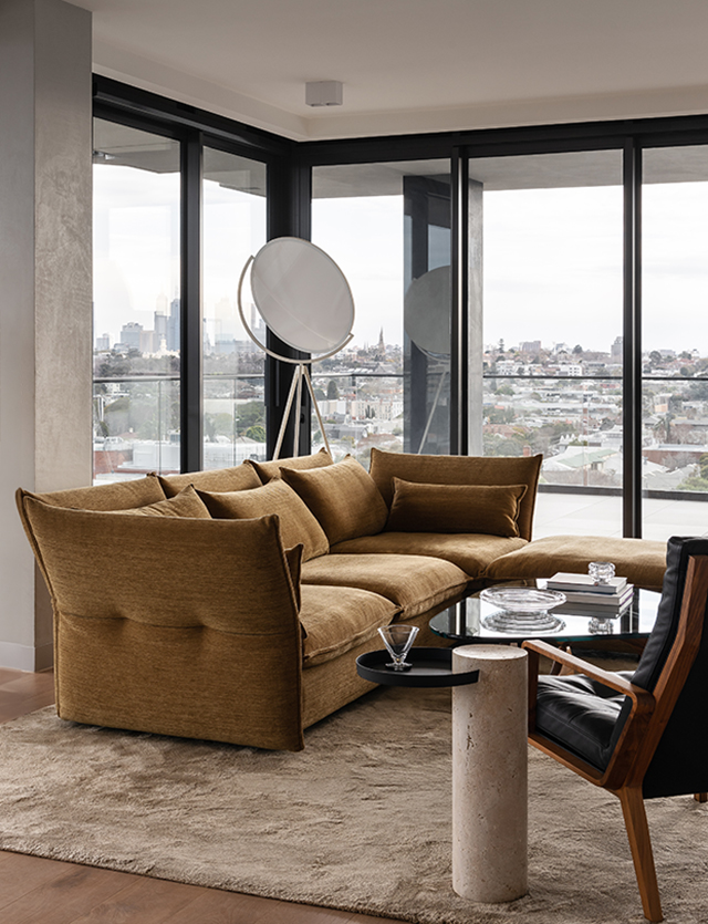
Pictured: Cover lounge chair and Relevo rug
Relevo Rug by Muuto
The Relevo has a distinctly sculptural quality. Its striking graphic pattern is produced by trimming the tufted wool in different levels, thereby creating an eye-catching shadowplay that gives a sense of being two-tone rather than monochrome. The rug’s single rounded corner gives it a unique character.
How did you choose Studio Bright to design it?
The site is only 4.27 metres wide, so I spent a long time looking for an architect who would be excited to do something innovative with this footprint. We have two kids and a dog, so we needed enough space for everyone to fit. The house was so tiny that it required personality, creativity – not just an open plan with a white box on the back. Studio Bright had some interesting ideas right off the bat; the house they first designed for us is not too different from where we ended up.
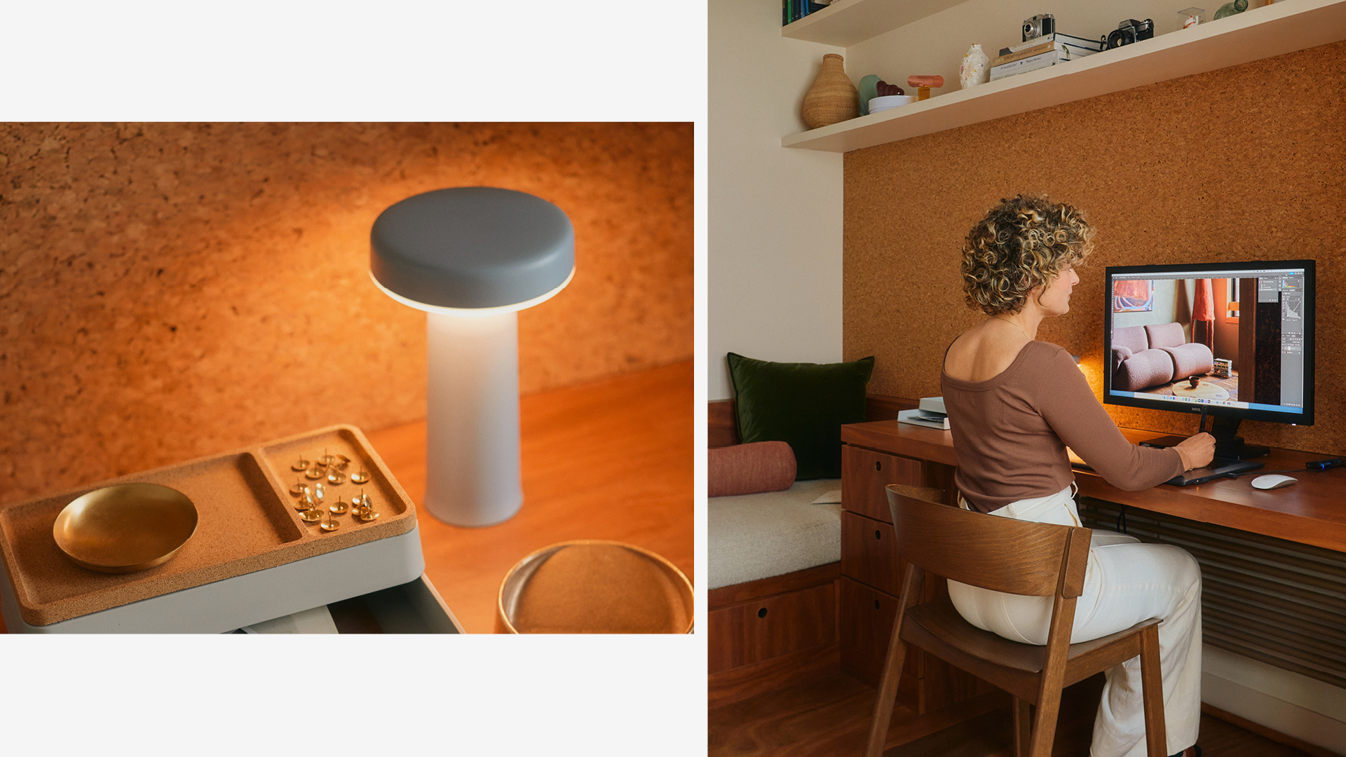
Pictured: Ease Portable Lamp and Cover side chair
Ease Portable Lamp by Muuto
The Ease Portable Lamp transforms the table lamp typology into a carriable size suitable to take wherever. Ease offers a high-quality dimmable, no-glare light, striking a balance between atmospheric and functional light. The design has a distinct lightness to it, with the top and bottom gently touching.
This interview is part of “Inside with…” a series of home stories and studio visits produced by Muuto in collaboration with Berlin-based production studio, Friends of Friends.
Architect: Studio Bright
Production: Friends of Friends
Photography: Amelia Stanwix

