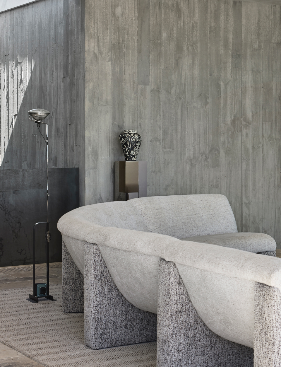
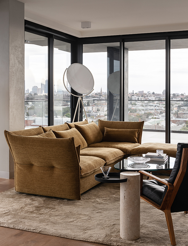
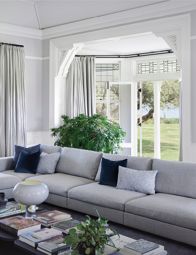
In design, creating something truly different can be easier said than done, yet for Sydney-based interior design studio Baldwin & Bagnall, the challenge provided the opportunity to bring an uncompromising vision to life.
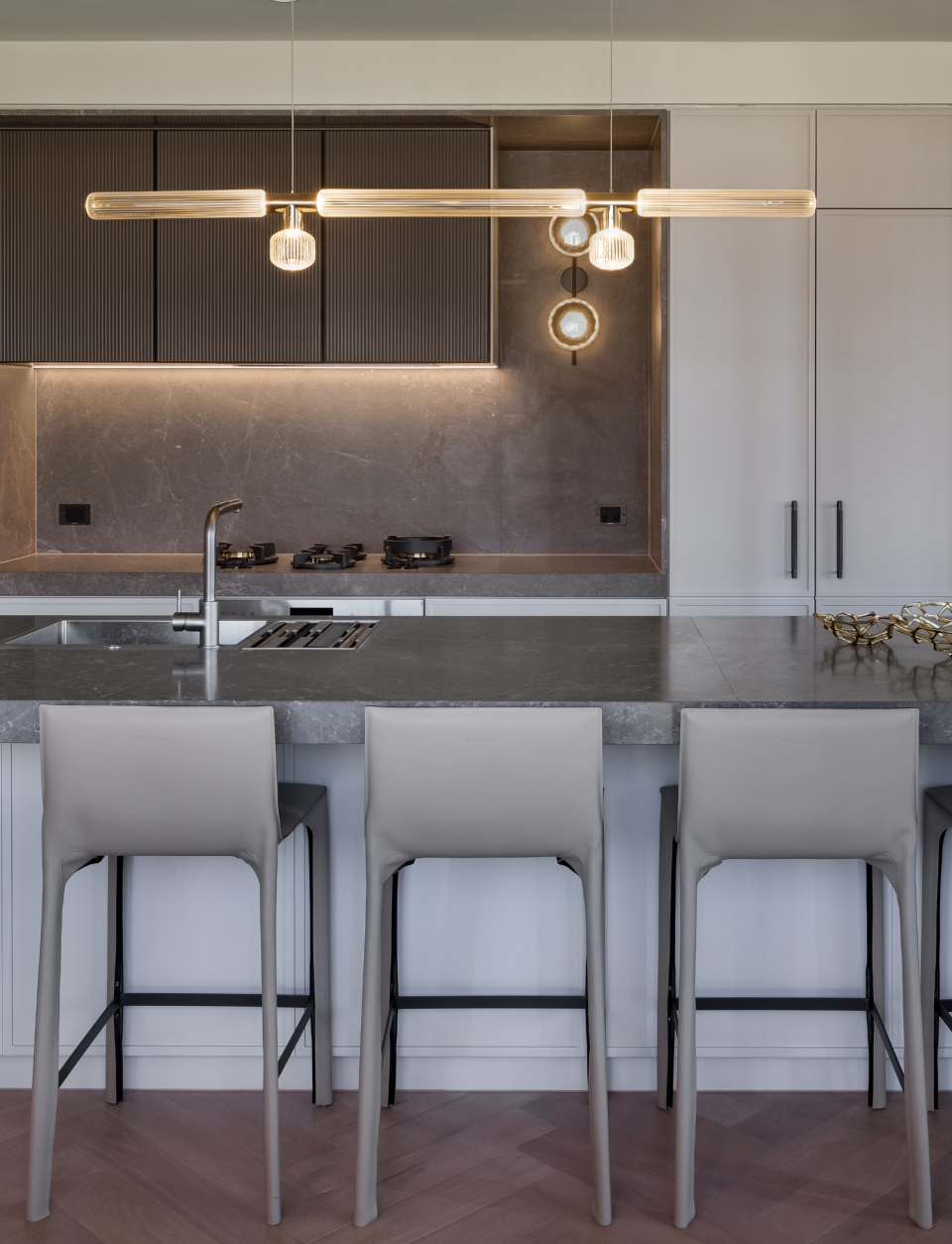
The Broad Residence is named, somewhat cheekily, for its position on an extremely narrow block, which had a great influence on the design approach to ensure the kitchen and living spaces did not feel small. The designers worked with a minimalist approach to materials, and cleverly integrated storage to make the most of the available space.
It is important to consider how your design interacts with other elements to create a wider design. The spatial relationship of pieces in a minimalist home allows you to take notice of pieces individually and as a whole in a way you might not have before.
"Our brief from the young family of 4 was to design a house with a unique identity. Something that was completely theirs and didn't look like other homes within the neighbourhood. The desire for a unique home afforded the opportunity for an uncompromising vision, distinct concept and a high level of creative freedom and bravery on our part," explained Hayden Bagnall.
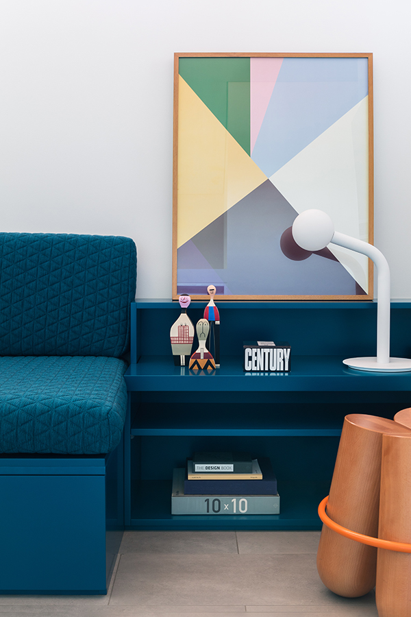
Embracing minimalism in no way means that your space has to be any less creative. In fact, when you’re not bogged down in complex details, you often get a chance to explore and play with clever relationships hidden within your design.
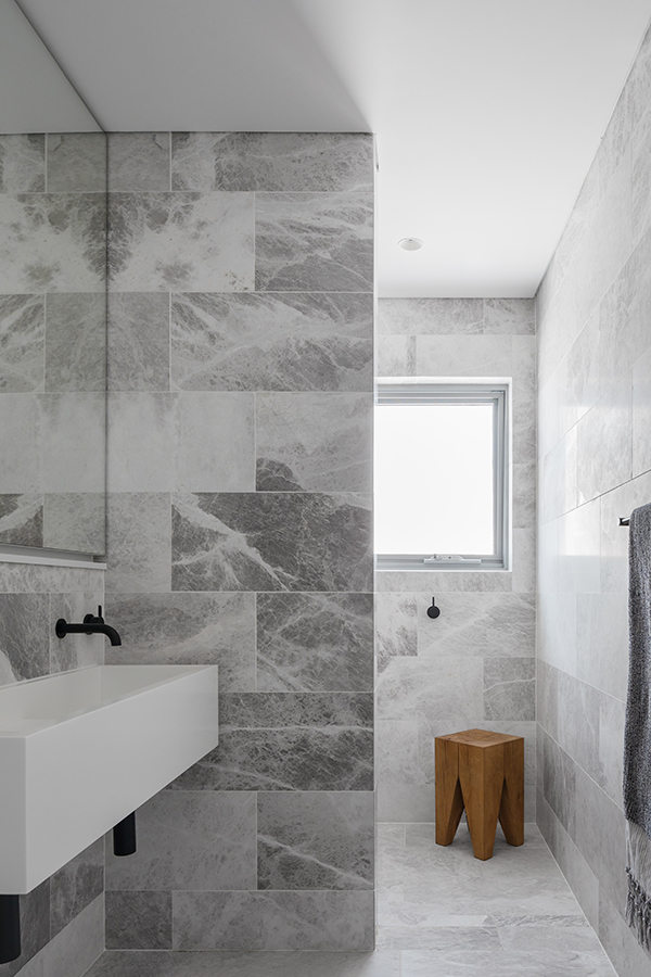
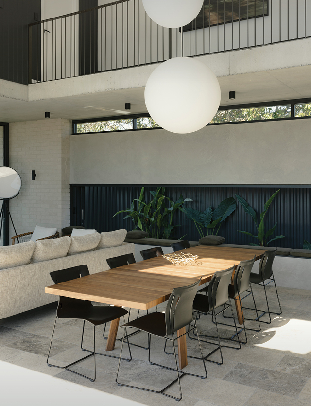
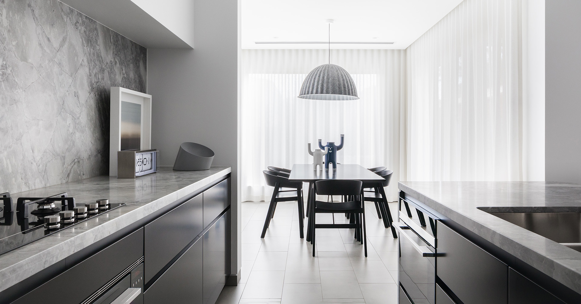
Minimalism isn’t about the complete lack of decorative elements, but rather the careful choice of when and where to use them. "Project Broad is minimal, contemporary & full of hidden surprises. As well as being a home for a young, vibrant family, it makes a strong design statement," claimed Hayden. To dress the dining space Baldwin and Bagnall chose Muuto Cover Chair in black and a Muuto Under the Bell Pendant Lamp in grey, keeping with the monochrome colour scheme yet playing with shape to keep things interesting. Minimalism is often about stripping away all the unnecessary things and focusing on the communication.
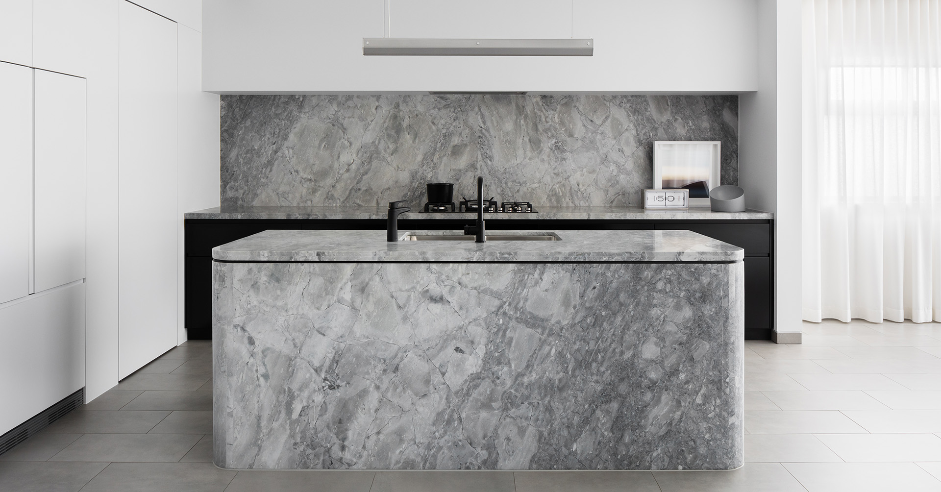
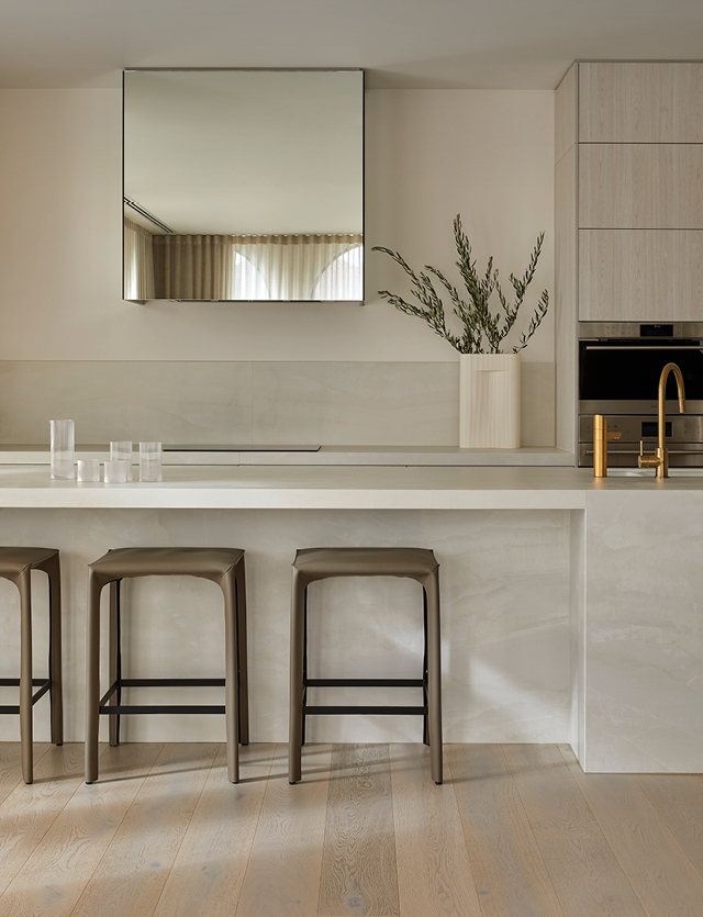
"Using fewer materials at volume had a dramatic impact," explained Hayden, "the sculptural kitchen, achieved through an altar-like appearance of a solid stone island, is evocative, expressive and dramatic. The minimalist approach, devoid of fuss and unnecessary embellishment, fuels a cold practicality that is surprisingly welcoming to the family or occupants." The Derlot Sfera Bowl in the kitchen ties in with this aim, brilliant for functionality. A clean, clear and uncluttered design.
What’s more minimal than a white & black colour palette? White space, also known as ‘negative space’, can sometimes be looked at as just empty or blank space, but this is not entirely accurate. When used well, white space can help balance out your design. We can see this in the bedroom. White walls, complemented by black minimal accents, in this case the Monocle Sconce from Rich Brilliant Willing helps to balance out the bedside design, declutter it and help it breathe.
To summarise the project Hayden explained, "Project Broad is characterised by carefully selected materiality, meticulous detailing and an aesthetic that delights head, heart and hands. The convergence of form and function is seamless, with the delivery of a practical, balanced family home that is simultaneously striking and unique. There is a strong feeling of a thoroughly original family who live here, evocative of a socially cohesive, distinct and enlightened modernity for the ages. The design has captured this feeling and brought it to life."
