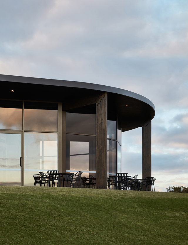
Insight Body and Mind is a wellness space combining psychology and mindful movement to inspire positive change.
Wellness has become a more holistic concept in recent years, encompassing both body and mind. Melbourne-based Insight Psychology had a vision to evolve its practice into a more integrative experience with psychology and mindful movement to inspire and empower positive change.
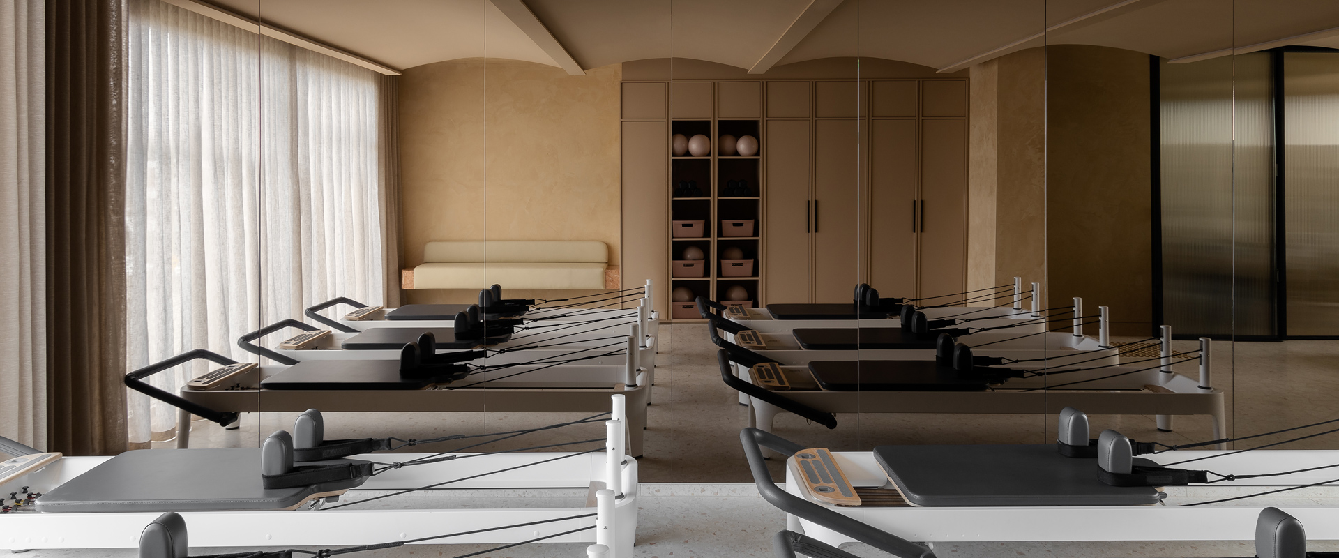
Insight approached Melbourne design studio Biasol to create a space that reflects its new approach to physical and mental health and generated a cogent brand identity. Biasol designed Insight’s interior and branding to reflect its integrated approach to health and wellbeing, with light-filled spaces, sculpted forms and graphic stone evoking energy, life, and flow. A layered colour and material narrative represents the two overlapping elements of the business, and gradually lightens through the three levels to provide a sensory and transcendental spatial experience.
Insight’s two-pronged approach is addressed in the space’s colour scheme and material language, which transition seamlessly from the consulting rooms to the movement studios. The schemes are intended to be “distinct yet integrated”, gradually lifting and lightening across the three levels to provide a “sensory and transcendental” spatial experience.
Deep teal tones were used for the psychology spaces on the ground floor to engender a sense of professionalism and groundedness. Grey Venetian rendered walls provide a subdued stone-coloured backdrop for the deep greens of the reception counter, bathroom vanities and kitchen surfaces.
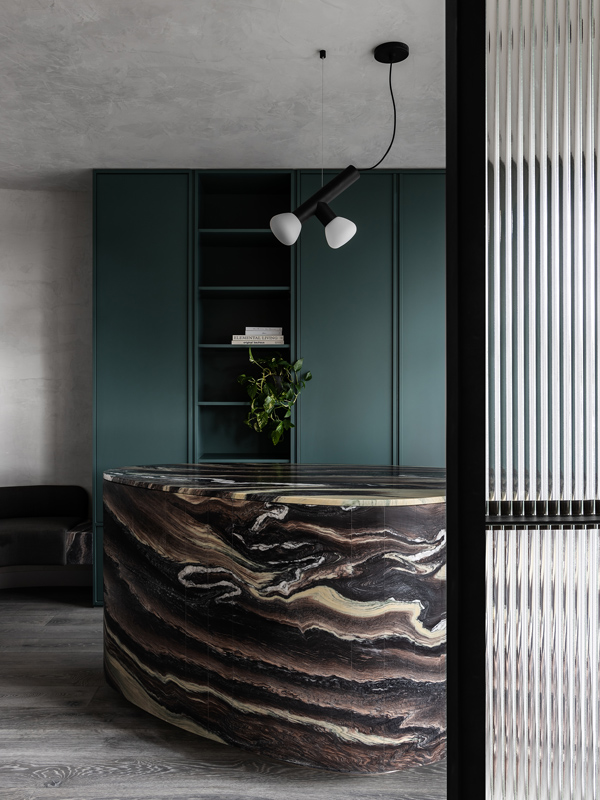
The veining of the Cipollino Ondulato marble counter is evocative of the ocean floor and reinforces the rhythm of flow throughout the space.
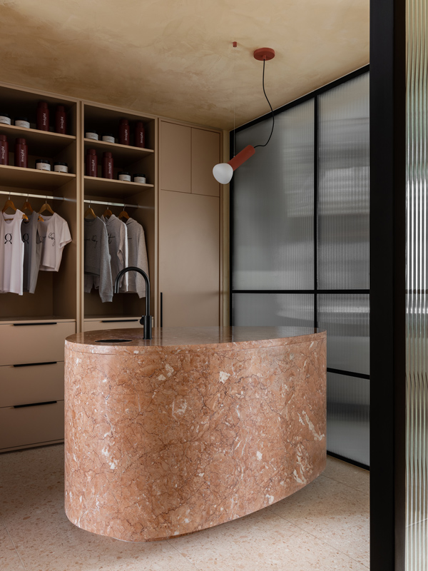
Biasol used minimalist circular forms to create a clean, modern brand identity and a spatial experience that inspires movement and positive change. In harmony with this aesthetic, Biasol selected Lambert et Fils’ Parc lights to compliments the minimalist, colour blocking notes of the space. Parc is a collection inspired by childhood imagination and the essentiality of homemade forms—created in collaboration with Swiss designer Adrien Rovero. Evoking the archetype of a flashlight, each lamp of the Parc Collection is a playful reminder of time spent in nature, when a simple tube and piece of string could be used to fashion any number of creations. These makeshift things, at once naive and functional, harness the unique beauty of peeling an object back to its essence.
“The Lambert & Fils Parc 02 & Parc 03 Pendant were perfect above our receptions on both Ground Floor and Level 1. We wanted something that was modern and minimal yet had some form in working within the flow of each space. The Terracotta fitted perfectly with the palette on Level 1, whilst the Black was also fitting for the Psychology Reception on Ground.” - Jean-Pierre Biasol.
The resulting space creates a cohesive narrative from the cerebral to the corporeal, from the anchored stone fixtures on the ground floor to the sheer, billowy curtains on the top level.
Photography: Timothy Kaye
Design by: Biasol

